Posts by hdcoadmin
Alfred Friendly Fellow falls in love with Excel during IRE training
By Mugambi Mutegi Editor’s note: in July, IRE hosted the 2013 class of Alfred Friendly Fellows for training in training in computer-assisted and investigative reporting, covering Excel spreadsheets and more. One of the fellows, Mugambi Mutegi, wrote about his experience using Excel for the Alfred Friendly Press Partners, republished below. In the short time I have been alive,…
Read MoreCountries with longtime FOI laws have less corruption, better human development
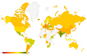
The Center for Law and Democracy rates FOI law effectiveness by country. Freedom of Information Act advocates have consistently claimed that institutionalizing the right to information will benefit countries, particularly in addressing corruption. They are not lying. By comparing indices on corruption, human development, and years of having an FOI law across 168 countries, I…
Read MoreU.S. Spends $24 Million on ‘Propaganda Plane Few Can See or Hear
Foreign Policy reports: “For the last six years, the U.S. government has spent more than $24 million to fly a plane around Cuba and beam American-sponsored TV programming to the island’s inhabitants. But every day the plane flies, the government in Havana jams its broadcast signal. Few, if any, Cubans can see what it broadcasts.…
Read MoreU.S allowed Italian kidnap prosecution to shield higher-ups, ex-CIA officer says
“A former CIA officer has broken the U.S. silence around the 2003 abduction of a radical Islamist cleric in Italy, charging that the agency inflated the threat the preacher posed and that the United States then allowed Italy to prosecute her and other Americans to shield President George W. Bush and other U.S. officials from…
Read MoreESU Foundation: Where did the $250G contribution go?
The Pocono Record posted nearly 14,000 public documents (won in a protracted public records court battle) in a search for clues about what happened to money pledged to project at a public college. The effort paid off as a reader flagged a needle in the haystack.
Read MoreSuffolk street gang said to be recruiting as young as 9
According to a Newsday report, “a North Bellport street gang that calls itself the “Natural Born Killers” is recruiting children as young as 9 years old to join the group, said residents and the head of the Suffolk County Legislature’s public safety committee.”
Read MoreAlexandria Police Shield Information on Officer-Involved Shooting
“No video. No audio. No transcripts. The Virginia Supreme Court operates in a total blackout. The Alexandria Gazette Packet exposes the shocking lack of transparency at the commonwealth’s top court.”
Read MoreCritics question billion-dollar tutoring program
“A decade after schools were required to offer tutoring sessions by third-party vendors, an increasing number of school districts and researchers say the multibillion-dollar system is broken,” according to The Sacramento Bee.
Read MoreExtra paid sick days costing city millions
“According to a Los Angeles Times examination of data obtained under the California Public Records Act, Los Angeles’ Department of Water and Power has paid thousands of employees a total of $35.5 million since 2010 in extra sick days under an unusual program that the utility’s top executive acknowledges has been vulnerable to abuse.”
Read MoreUSA Today examines players in the risky supplement game
USA Today launched the first part of its investigation titled Supplement Shell Game: The People behind risky pills. The first article examines Matt Cahill, who has spent time in federal prison and now faces another federal charge after creating a series of products over the past 12 years — one of which contained a pesticide…
Read More