CAR Conference Blog
PANDA: Make the robots work for you
As expected, there was no shortage of swag at “Make the robots work for you,” a panel on implementing PANDA, data store of the gods, brought down the mountain to a newsroom near you. (In the interest of full disclosure, the integrity of your reviewer was compromised by a free T-shirt.) For those of you…
Read MorePhotos from Lightning Talks

Lightning Talks moderator Derek Willis of the New York Times kicks off the event filled with fast paced, pithy presentations. Organized by Willis and New York Times colleague Aron Pilhofer, lightning talks debuted at the 2010 CAR Conference in Phoenix and have grown in popularity — this year’s lightning talks had an overflow crowd. Ben…
Read MoreFrom CAR to news apps and back again
Reporting and app development don’t have to be separate processes. In fact, the earlier these workflows are integrated, the more efficient both processes can be. This makes for better reporting and presentation, which amplifies your value for your audiences. This was the main take-away from a power-panel of Lena Groeger, Ted Mellnik, Charles Ornstein, Serdar…
Read MoreThe one-query story: quick hits for your newsroom
Not all data reporting needs to be a long-term project. Quick-hit queries are helpful for feeding the beast with substance, and they’re a great way for reporters new to computer-assisted reporting get used to the process. The best advice, regardless of beat, is to develop what IRE Training Director Megan Luther calls an “arsenal.” This…
Read MoreDashboards for reporting
Think of a data dashboard as a bird’s-eye view of data that gets automatically updated in real-time. It’s like a news app meant only for internal use, and the ultimate goal is to make repeat reporting processes more efficient. Aaron Bycoffe of The Huffington Post and Derek Williams and Jacob Harris of The New York…
Read MoreInside baseball: What data journalism can learn from sports

Photos by Travis Hartman What if you could predict a hospital’s quality of care the same way baseball statisticians can predict a pitcher’s season or a team’s record? The sports world has long been using statistics in creative ways — and Ryan Pitts, Jeremy Bowers and Matt Waite say journalists can and should tap into…
Read MoreBeyond charts, making interactives fun
Fun does not equal fluff. Spice up data viz and you can “take a wonky topic and personalize it,” said Tasneem Raja of Mother Jones in the “Making interactives fun” session. Also, fun interactives build your credibility for the hard-nosed investigations down the line. When readers see how you deftly handle dog license data they…
Read MoreInvestigating the Workforce
Unions and pensions may sound like daunting subjects to cover, but Tom McGinty of The Wall Street Journal and MaryJo Webster of the St. Paul Pioneer Press lay out compelling reasons to get past that impression, and helpful tools to get you there. McGinty (who stresses he is not a labor reporter, but learned a…
Read More2012: The Year in CAR
IRE executive director Mark Horvit and training director Megan Luther presented the Year in Car yesterday, highlighting data-driven journalism from across the country in 2012 and what can be learne from them. Here’s their list: California Watch: Broken Shield FINDINGS: Exposed flaws in the way a special state police force handles crimes against the developmentally…
Read MoreInvestigating income inequality with the Gini coefficient and other data
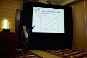
Paul Overberg, of USA TODAY, points to a graph of the Gini Index, which is a measure of income inequality. The diagonal line is perfect distribution of income and the curved line is a representation of actual distribution income. Overberg is interested in the space between them and what it describes. Photo by Travis Hartman.…
Read More