Posts Tagged ‘CAR Conference’
Investigating the Workforce
Unions and pensions may sound like daunting subjects to cover, but Tom McGinty of The Wall Street Journal and MaryJo Webster of the St. Paul Pioneer Press lay out compelling reasons to get past that impression, and helpful tools to get you there. McGinty (who stresses he is not a labor reporter, but learned a…
Read More2012: The Year in CAR
IRE executive director Mark Horvit and training director Megan Luther presented the Year in Car yesterday, highlighting data-driven journalism from across the country in 2012 and what can be learne from them. Here’s their list: California Watch: Broken Shield FINDINGS: Exposed flaws in the way a special state police force handles crimes against the developmentally…
Read MoreInvestigating income inequality with the Gini coefficient and other data
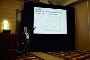
Paul Overberg, of USA TODAY, points to a graph of the Gini Index, which is a measure of income inequality. The diagonal line is perfect distribution of income and the curved line is a representation of actual distribution income. Overberg is interested in the space between them and what it describes. Photo by Travis Hartman.…
Read MorePhotos from ‘A night on the town’

A CAR conference atendee throws a ball down the lane on Thursday night in Louisville. Photo by Travis Hartman, IRE/NICAR. Stephanie Peuriere from Strasbourg University bowls at the after hours bowling event on Thursday night in Louisville. Photo by Travis Hartman, IRE/NICAR.
Read MoreGetting started with an open-source database manager: MySQL
If you’re working from a Mac computer or getting into truly large datasets, Access may not be a viable option as a database manager. (It doesn’t work on Macs, and there are row limitations.) A good alternative is MySQL, an open-source database manager, which Alex Richards of the Chicago Tribune taught on Friday. MySQL essentially…
Read MoreData Viz on the fly
John Keefe of WNYC said anticipate question before your audiences asks them. Is a hurricane headed my way? Am I in a flood zone? Preparing for an emergency should happen before the storm sirens start blaring. The same goes for your data visualizations, Keefe said. His newsrooms uses Google Fusion tables, Mapbox and Google Spreadsheets…
Read MoreIntegrity checks and simple data cleaning – the art of doubt
There is a saying about software engineering that could easily be applied to formatting data. The truism goes something like, “it’s like looking for black cats in a dark room that has no cats in it.” And then, someone yells, ‘I got one!’” Well, Joe Kokenge of ProPublica is practicing animal control. His presentation on…
Read MoreSmarter interactive web projects with Google spreadsheets and Tabletop.js
Using tabletop.js, one editor and two researcher, presenter Tasneem Raja of Mother Jones got the remarkable 47% graphic online for Mother Jones in under five hours. If that’s not reason enough for you to try tabletop.js, consider this: Raja says Tabletop has been an absolute “game changer” for the Mother Jones newsroom. Think of tabletop.js…
Read MoreData viz on a shoestring
The plethora of data visualization tools available these days creates a high-quality problem: a lack of resources to create visualizations becomes a hard task of choosing which of the many to use. Sharon Machlis of Computerworld offers a rapid-fire, well organized and nearly comprehensive inventory of data visualization tools that can be deployed for little…
Read MoreBeware of data – cautionary tips and tales of statistics
A nine year-old girl was beaten to death by her foster brother in Kentucky, but the tragedy did not become a statistic. The state agency in charge of counting abused children didn’t categorize it as a death, attorney Jon Fleischaker said in the “Legal issues, access and big data” session. Local and state government goes…
Read More