Posts Tagged ‘Hurricane’
Track the economic impact of Hurricane Matthew
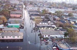
View of Hurricane Katrina destruction in the city of New Orleans. (Photo by NOAA / Creative Commons) In the wake of any natural disaster, there’s a seemingly endless number of public service and accountability stories to chase. You want to know when the power is going to come back on. How many people have been…
Read MoreHow to build a better weather story: Tips for reporting before, during and after the storm
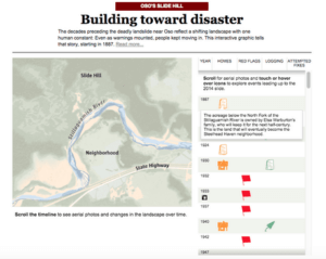
A graphic from the Seattle Times’ coverage of the Oso, Washington landslide Does your newsroom have the data and resources it needs to cover the next big storm? With a little preparation, you can have detailed information on critical infrastructure – like dams and levees – ready to go the next time a hurricane or…
Read MoreBehind the Story: How NPR and ProPublica exposed problems with the Red Cross’ response to Superstorm Sandy

Justin Elliott of ProPublica Justin Elliott, Jesse Eisinger and Laura Sullivan turned a vague tip about the American Red Cross’ inefficiency into a powerful report about the organization’s failings after Hurricane Isaac and Superstorm Sandy. The joint project between ProPublica and NPR revealed that hundreds of millions of dollars pouring in from donors in 2012…
Read MoreGetting started with Tableau Public

Photos by Travis Hartman I walked into the Tableau Public session with absolutely no experience — and within about 10 minutes the instructor had us open up some data, sort through a few of the elements, and create a visualization. Its immediate ease of use is clear. To produce quick, coherent interactive charts seemed pretty…
Read MoreHurricane Sandy: How data journalists spread information about the storm
Google Crisis Response created this interactive map showing weather, emergency shelters and power authorities. As the East cost braced for Hurricane Sandy, data journalists across the country were working in realtime to spread the news. We gathered some of the interesting interactive coverage and data visualizations we found from around the web. Have a suggestion…
Read More