
If you fill out the "Forgot Password" form but don't get an email to reset your password within 5-10 minutes, please email logistics@ire.org for assistance.
By Anthony DeBarros
USA TODAY
In April, after USA TODAY published its Ghost Factories investigation into forgotten lead smelters, we heard from several people who wanted to know more about how the project came together — particularly the online package that included details on more than 230 of the former factories.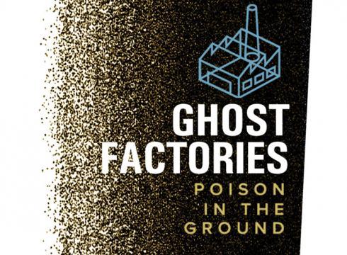
The following is an expanded version of a post I originally sent to IRE’s NICAR-L mailing list:
Alison Young was the lead reporter who conceived the idea for the project. In late 2010, she came to me with a couple of PDFs showing a list of suspected lead smelter sites, which I parsed into a spreadsheet and plotted on a Google map for her to research. Then she started digging, as one of our editors said, “Armed only with faded photographs, tattered phone directories, obscure zoning records, archival maps, fuzzy memories of residents and shockingly incomplete EPA studies.”
In December 2010, she began filing the first of more than 140 FOIA requests. The requests produced thousands of pages of government documents related to the sites, and to catalog them she created a project inside DocumentCloud. The product was extremely helpful both for organizing documents and for presentation. Brad Heath of our investigative team would later use the DocumentCloud API to integrate metadata from the documents — particularly their titles — into our database so we could present them online. He also used the API to batch-publish all 372 documents that were included in the project. (He did most of the work using python-documentcloud, a Python wrapper by the Los Angeles Times’ Ben Welsh that makes it easy to interact with the API programmatically.)
While reporting, Alison learned about the old Sanborn fire insurance maps and spent weeks with an intern in the basement of the Library of Congress locating addresses in the maps to determine which ones really had been factories and which were just business offices.
Denny Gainer, an online producer and photographer, then spent nearly two months at the Library of Congress photographing 177 Sanborn maps using a set-up of synced multiple flash units. Excited about the level of the hand-drawn detail, Denny suggested overlaying the Sanborns onto Google maps so readers could compare them with present day context. Denny and Brad spent a lot of time finding the best solution, ultimately deciding on ESRI’s ArcGIS to georeference the coordinates and MapTiler to render thousands of tiles for various zoom levels.
Meanwhile, Alison and Pete Eisler hit the road with X-ray fluorescence guns rented from Thermo Fisher Scientific and visited 21 former smelter sites to perform soil tests. The guns export two files — an un-alterable .ndt file and a spreadsheet, the latter of which we compiled into a master list of samples. They also sent samples to a lab for independent testing. In the end, we loaded about 1,000 test results into our database.
The online storytelling concept and build out was led by our design group, which included Kristin DeRamus, Chuck Rose, Corey Greeneltch and Stan Wilson Jr. Along with telling the story about forgotten factories and the effects of the lead they left behind — plus presenting the results of our soil testing – they had the overall goal of building an application that would be portable across the web and tablets. They spent a lot of time storyboarding the design and discussing with us the best way to present the documents, photos, videos, maps and data on every site until we agreed on a compact but rich set of features.
Once that was done (and while Alison was continuing reporting), a team of nearly two dozen of us set out to build components of the app.
First, we turned to getting the data ready. I built a database in SQL Server and loaded the text and data on each site, including the soil tests and locations. The database also included links to all assets associated with a factory site — the documents plus photo and video. Alison and Pete had taken photos and video during site visits, and our photographers and video journalists had shot more. In the end, the online application would include 14 videos and dozens of photos.
To manage all the information in the database, Chris Schnaars built a basic editing application and deployed it to an internal server. For the interactive developers, I wrote a Python script to generate one JSON file for each site out of the database so we could publish the app without needing to deploy a database. Instead, we just published the flat files. This New York Times blog post highlights the value of using flat files when possible; for us, it just makes life simpler. The Python script publishes the 230-plus JSON files in seconds.
With the basic data structure in place, our team — coders, designers, photographers, video journalists, reporters and editors — pushed hard to finalize the data set, finish production on stories and visuals, and write the code. A lot of the work was painstaking. Paul Monies spent many days geocoding smelter sites and test locations, and once they were plotted, Alison, Pete and I reviewed each location again.
To present the Sanborn maps, we used overlays atop Google maps on the 21 sites reporters visited. For the rest, we used a newly released HTML5 version of the Zoomify viewer. Denny produced all of these maps, working with the reporters to set the default viewer so that each would open and display the smelter location. One of our devs, Stan, wrote the JavaScript to fade the layers in and out and work with the Google map API. He also successfully incorporated the Zoomify viewer into the presentation.
There were a lot of moving parts to coordinate. So, we met daily to review our progress and brought in a project manager to track tasks, monitor roadblocks and keep us on schedule. We also set aside a QA tester to road test the app in various browsers, helping us head off post-launch compatibility issues.
In the end, the app and stories launched without a hitch over two days in April. The components are presented clearly and logically: a section for each of the project’s two days of coverage, a case study of one former factory, and a map of sites with the deep details from our reporting. Because we built metrics tracking into each layer of the app, we were able to see that our readers were engaging deeply with the content — and a month after publication it’s still drawing traffic as we continue to follow the story.
Anthony DeBarros is the Senior Database Editor at USA TODAY.

Looks like you haven't made a choice yet.