
If you fill out the "Forgot Password" form but don't get an email to reset your password within 5-10 minutes, please email logistics@ire.org for assistance.
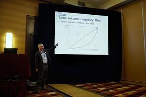
Allow me to introduce you to your newest friend, Corrado Gini, an early 20th century Italian statistician. He created the “Gini coefficient,” the best yardstick to measure income inequality in your area and around the world.
Writing about income inequality isn’t about the poor, it’s about everybody, Paul Overberg of USAToday said. Also, it’s not an income “gap.” Don’t forget the folks in middle income brackets. Income inequality tells the story of the“whole texture of society,” he said.
If you tackle this topic, which you should, you’ll have to overcome resistance from your editors who might think the story is a “leftist plot you’re trying to sneak into their newsroom,” Overberg said.
Himanshu Ojha of Reuters explained his team’s process for their series on income inequality, which took six months to produce. They used calculated Gini coefficients for counties directly from the Census bureau (not available online), one year American community survey data, IPUMS microdata, and current population survey microdata from the Census bureau and Bureau of Labor Statistics.
The analysis was built on the gini coefficient, median household income and poverty rate, and income quintiles, which breaks up the population into five equal parts. As a side note, you can look at the second to the fourth quintiles to assess how much of the income pie the middle income classes share.
Robert Gebeloff of the New York Times expanded the income inequality picture beyond the Census.
The Census comes with a few challenges, including:
Another dataset to consider is the IRS Survey of Consumer Finance, which looks at more measures of income, including debt and assets. Please note that it is a small database and is most powerful at the national level.

Looks like you haven't made a choice yet.