
If you fill out the "Forgot Password" form but don't get an email to reset your password within 5-10 minutes, please email logistics@ire.org for assistance.
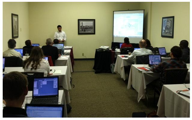
Journalsts at the 2012 CAR Conference attend hands-on Tableau training.
Photo courtesy of Tableau
By Daniel Hom
Tableau Public
Many journalists have experienced leafing through stacks of documents, searching for important numbers to back up stories and trying to relay all of that in a way that captivates readers. It’s a world where too often multimedia means simple graphs and interactivity a time-consuming Adobe Flash graphic.
I know these experiences because they were my own when I worked in the journalism industry. I’m a bit of a numbers nerd, but I also love telling stories. I often struggled with how to combine both in a compelling way, and I know I wasn’t alone. That’s ultimately one of the reasons I joined Tableau: the prospect of working at the intersection of data and storytelling.
You can imagine my pleasure then, at seeing a roomful of journalists share in that enthusiasm at NICAR 2012. In my year with Tableau, I have witnessed a monumental change in the way journalists approach data. More people are looking to take data and use it to tell important stories across all kinds of beats. Our hands-on training at NICAR was so sought after we had people lining up out the door for the chance that someone would no-show. People really do want to work with data.
We spent several hours digging through a government-produced data set about the US’ foreign loan and grant contributions to every country for the past several decades. Whether it was the rise in foreign aid as a whole over time (as a percentage of GDP), increasing money spent towards nuclear non-proliferation and anti-terrorism, or the fact Canada has received loan and grant money at all, everyone walked away with interesting nuggets of information along with a powerful working knowledge of Tableau.
But learning to use a new piece of software wasn’t the highlight of the day; it was seeing journalists start to tell their own data stories with their own data. Before NICAR ended, several journalists approached us with visualizations they were creating. Here’s one example courtesy Kate Martin of the Skagit Valley Herald, who had her visualization published online within a day of our training. Who knew there was data about roadkill? More importantly, who knew that it would look so beautiful mapped out? We hope this is just a small sign of what’s to come from the industry as a whole.
If you were unable to join us for the hands-on Tableau Public training, be sure to visit our website to get a taste of what we did Many thanks to NICAR for allowing us to attend — we look forward to partnering even more with the journalism industry in the future.
Daniel Hom, a gradute of Northwestern Univeristy's school of journalism, works at Tableua as data analyst. He led hands-on training of Tableau at NICAR 2012. Tableau was one of several tools taught at the conference that help journalists visualize their data.

Looks like you haven't made a choice yet.