Posts Tagged ‘mapping’
Tools and techniques for using geolocation in your next investigation
By Katie Le Dain If you go to your iPhone and head to the privacy settings, you’ll find a switch that asks you whether you want your location services “on” or “off.” At Friday morning’s geolocation session at the annual IRE Conference, panelists talked about how cell phones can track when this button is turned…
Read MoreIRE, Esri partner to offer fellowships for mapping training
IRE and Esri have partnered to offer fellowships to attend mapping training at the 2015 Esri Conference from July 18-22 in San Diego or the IRE Mapping Boot Camp from August 7-9 at the University of Missouri-Columbia, Mo. The Esri Conference fellowships cover airfare and four nights lodging, and the Boot Camp fellowships cover airfare and three nights lodging. The Esri Conference…
Read MoreFree upgraded Carto accounts for IRE members
**October 9, 2018 update: Starting today, Carto will no longer offer free account upgrades to IRE members. This will not affect anyone who previously received an upgrade. Today IRE is announcing a partnership with Carto to provide upgraded accounts free to IRE members, who can use Carto to analyze data and tell stories with interactive maps. Upgraded accounts…
Read MoreIRE Radio Podcast | Product of Mexico
We’re changing up the podcast this week and spending our entire episode on one story. IRE’s Shawn Shinneman talked with Los Angeles Times reporter Richard Marosi about his 18-month investigation into the working conditions of Mexican agribusinesses supplying produce to major U.S. supermarkets and restaurants. Tune in to hear Marosi discuss the reporting challenges he…
Read MoreIRE and Esri mapping fellowships awarded
IRE and Esri, the leading commercial publisher of geographic information system (GIS) software, have awarded 13 fellowships to attend Esri’s annual International User Conference and IRE’s mapping bootcamp. Fellowships to the User Conference July 13-17 in San Diego were awarded to: Leslie Griffy, Independent journalist Chris Hanson, KTRK-Houston Glenn Howatt, The Star Tribune Ingrid Lobet, Houston Chronicle Hoa Nguyen,…
Read MoreBehind the Story: How KDNK investigated gas spills on private property
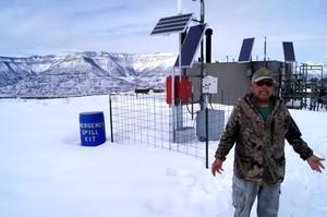
Photo courtesy of KDNK Oil and gas companies reported about 90 spills last year in heavily-drilled Garfield County, Colorado. Many of the leaks happened on private properties leased to drilling companies, said Ed Williams, a reporter at community radio station KDNK. But when unsafe levels of dangerous chemicals like arsenic and benzene contaminated the land,…
Read MoreIRE, Esri partner to offer fellowships for mapping training
IRE and Esri have partnered to offer fellowships to attend mapping training at the 2014 Esri International Users Conference from July 13-17 in San Diego or the IRE Mapping Boot Camp from August 8-10 at the University of Missouri-Columbia, Mo. The users conference fellowships cover airfare and four nights lodging, and the boot camp fellowships cover airfare and three nights lodging. The users conference schedule includes attendance…
Read MoreTableau announces Mac version to be released ‘early next year’
At its customer conference this week in Washington, D.C., Tableau Software announced that a Mac-compatible version of its software would become available along with the newest version, Tableau 8.2, to be released most likely “early next year,” according to the Tableau Public blog. Tableau’s public and desktop versions of its data analysis and visualization software…
Read MoreAssessing and mapping dangerous intersections, traffic fatalities in your community

A still image from the Orlando Sentinel’s Blood in the Streets animated video. By Scott Powers and Arelis Hernandez, the Orlando Sentinel This past winter, after an Orlando Sentinel editor almost ran down a pedestrian for the umpteenth time – a moment which occurred about the same time that our breaking-news desk had to write…
Read MoreHow to use boating accident data in an investigation

FCIR created this map of boating accidents. Click the map for the interactive version. Last January, Florida Center for Investigative Reporting and NBC 6 in Miami announced a partnership to produce more local in-depth investigations. Even before our partnership was announced, we had already decided during a brainstorm session that boating fatalities would be one…
Read More